Made for
The Reading Room at The Beethoven Exhibition of The Vienna Secession XIV
Year
1902
Material
Relief glass, cut-glass pieces, lead fillets
Dimensions
H. 69,5 x W. 70 cm
Execution
Carl Geyling’s Erben, Vienna
Koloman Moser 1868-1918, Leopold Museum, Vienna, 2007
Vienna 1900, Fondation Beyeler, Bâle, 2010-2011
Koloman Moser : Designing Modern Vienna, 1897-1918, Neue Galerie, New-York, 2013
Koloman Moser : Designing Modern Vienna, 1897-1918, The Museum of Fine Arts, Houston, 2013-2014
Koloman Moser : Universal Artist Between Gustav Klimt and Josef Hoffmann, MAK, Vienna, 2018 – 2019
Ver Sacrum, 1902, P. 293, 308
Baroni, D. & D’auria, A., Koloman Moser – Grafico E Designer, Milano, 1984
Koloman Moser 1868-1918, Leopold Museum, Vienna, 2007, P. 140-141
Vienna 1900 – Klimt, Schiele, and Their Times – A Total Work Of Art, Basel, Fondation Beyeler, 2012 – 2011, P. 28-29
Koloman Moser: Designing Modern Vienna, 1897-1918, Neue Galerie, New-York, 2013, P. 62, 374
Kallir, J., Viennese Design And The Wiener Werkstätte, London, Thames & Hudson, 1986, P. 127
The two window leaves were designed by Koloman Moser for the Secession Exhibition XIV (15.4.-27.6.1902) and installed in the Ver Sacrum room, remodelled as a reading room by Leopold Bauer. Exhibition XIV is deemed to be the conceptual origin and simultaneously the pinnacle of achievement in designing an exhibition as a Gesamtkunstwerk, a total work of art. It was organised to mark the presentation of the Beethoven sculpture completed by Max Klinger shortly before the exhibition opening. Writing in the exhibition catalogue designed by Alfred Roller, the Secession member and painter Ernst Stöhr describes the novelty of the project: “The idea was first of all to create a unified room, then to let painting and sculpture adorn it in compliance with the interior design.” Josef Hoffmann produced the basic architectural concept, which found its culmination in the side hall at the left, decorated with Klimt’s Beethoven frieze. Klimt’s frieze relates in content to Klinger’s Beethoven figure by visualising the quotation “Freude schöner Götterfunke” (Joy, the glorious divine spark) and “Diesen Kuss der ganzen Welt” (This kiss to the whole world) from the final chorus of Beethoven’s Ninth Symphony. Beethoven is seen as the solitary, suffering artist-hero (not dissimilar to Klimt’s situation after the negative criticism attacking his faculty pictures), who struggles to create a better, worthier life through his art. Klimt dedicates his frieze to the same theme of mankind’s yearning for happiness during the daily struggle for existence and of gaining it through the blessings of art. In this he simultaneously touches upon the central theme of the Secession movement inspired by the English Arts & Crafts movement – saving the world through artistic expression, an ideology based on the unity of the arts as postulated by William Morris – the equivalence of the higher (fine) and the lower (applied) arts. The intention was to guarantee the omnipresence of artistic expression in everyday life. Identifying art as potential medium for healing the world from the negative aesthetic and social effects of the Industrial Revolution thus set up a standard for the concept of integrated design. This resulted in the idea of the Gesamtkunstwerk, the total work of art, to which the Secession and its artists were wholeheartedly committed, and which elevated interior design into spatial art. Secession Exhibition XIV was the solitary, unprecedented pinnacle in aspiring to a total, integrated design concept as realised in a temporary exhibition, never again to be repeated with this consistency. It was no wonder that the influential German art periodical “Deutsche Kunst und Dekoration” devoted a whole issue to the XIV exhibition, with the focus on interior design.
Moser’s two window leaves in the “reading room” of Secession Exhibition XIV were created in complete harmony with this concept. The room itself was designed by the architect and pupil of Otto Wagner, Leopold Bauer. The Studio published a feature on it before the year was out, and Amelia S. Levetus, an Englishwoman living in Vienna, describes the room. While the artistic quality of the room is taken as self-evident, she places central emphasis on its contribution to the quality of life, fully in keeping with the programmatic conquest of everyday life by art. “The reading room, here illustrated, is a delightful little corner in white with one-toned flowers on the window sills, just the place where one could spend a cosy half-hour examining the works of art eying about it.” Bauer’s plan for this room was to construct a reading room for exhibition visitors and at the same time integrate four sculptures by George Minne. The reading room was set up in the so-called “Ver Sacrum” room to the right of the main entrance, today the location of the Secession bookshop. It formed the last station of the precisely routed exhibition course. The rectangular room, normally entered directly from the entrance hall through a narrow door on the longitudinal side, was during the XIV exhibition accessed by visitors via the right-side gallery of the main exhibition room and through a narrow door on the narrow side. As much a stage for exhibits as a functional facility for the reading of Secession publications (Ver Sacrum and exhibition catalogues), Bauer, having conceived his room as a total work of art, places it in the already provided interior space of the Secession building. Besides a large reading table with six armchairs and a large cabinet, the main showpieces were to be the four plaster sculptures by George Minne and the two window leaves by Moser. The works of Minne and Moser were not installed as individual art objects, but were contextualised architecturally and functionally with the wall. Their presentation serves in the end to structure the otherwise bare walls. To achieve this, Bauer changes the originally oblong floor plan of the room. He places a concave wall in front of each longitudinal wall, thus attaining sufficient wall depth to accommodate three concave, oblong recesses on their side ends. The height of the recess tops is defined by the height of the two lintels of the doors. This produces a continuous horizon, uniting three of the four walls in the room. But Bauer also creates a relationship with the fourth wall fitted with the two windows. He interprets the two window recesses as display niches for accommodating the two window leaves by Moser. They do not take up the total height of the existing window casement, but just two-thirds of the available space and leave an observation slit free to the outside at the bottom. The two narrow, high window openings are separated from each other by a wide section of wall and, in contrast to the remaining horizontally structured room, set a decidedly vertical accent. Bauer deliberately leaves this piece of wall empty, on the other hand uses the two windows quasi as a “hanging” location for the two Moser window leaves, thus transmuting them into pictures. They are each fitted mirror-inverted into their window frames, separated by the white section of wall, which acts as symmetry axis. Having been designed with this symmetrical alignment in mind, they are thus able – despite the separating piece of wall – to form a unified horizontal line in the context of the total windowed wall.
The painter Koloman Moser (1868-1918) studied at the Academy of Fine Arts in Vienna (1886-92) and the Kunstgewerbeschule (School of Decorative Arts) of the k.k. Österreichisches Museum für Kunst und Industrie (Imperial Royal Austrian Museum of Art and Industry) (1893-95). In 1892 he joined forces with artists of a similarly progressive bent to form the “Siebener Club” (The Club of Seven), which in 1897 engendered the Vienna Secession, of which he was a founding member. He gained prominence in the 1890s primarily as a graphic artist and draughtsman for several art periodicals and illustrated magazines. His innovative talent as a graphic artist was a particular boon for the Secession’s own magazine “Ver Sacrum”; Moser was a leading member of the editorial staff right from the beginning. Besides his work as a member of Otto Wagner’s architectural bureau in 1898/99 where he was in charge of façade and wall decoration, he produced designs for the entire gamut of the decorative arts, with total commitment to the unity of the arts propagated by the Secession that lasted until his exit from the Wiener Werkstätte in 1907. From 1900 on, he was professor of the special class for decorative draughtsmanship and painting at the Vienna Kunstgewerbeschule and was thus one of the prime movers in the propagation of the new artistic ideas in the Austrian-Hungarian monarchy. Encouraged by the success of his artistic collaboration with Josef Hoffmann within the Secession, in 1903 he joined up with Hoffmann and founded the Wiener Werkstätte, a working cooperative of artists and craftsmen after the model of the English Guild of Handicraft. This enabled them to create an infrastructure that supported a direct realisation of their artistic designs in the desired superlative quality. It helped them to cover practically every aspect of everyday life – architecture, furnishing, textiles and wallpaper, tableware, ladies’ fashions, jewellery and even postcards and more – thus realising their vision of the Gesamtkunstwerk for their financially potent clientele of the haut-bourgeoisie.
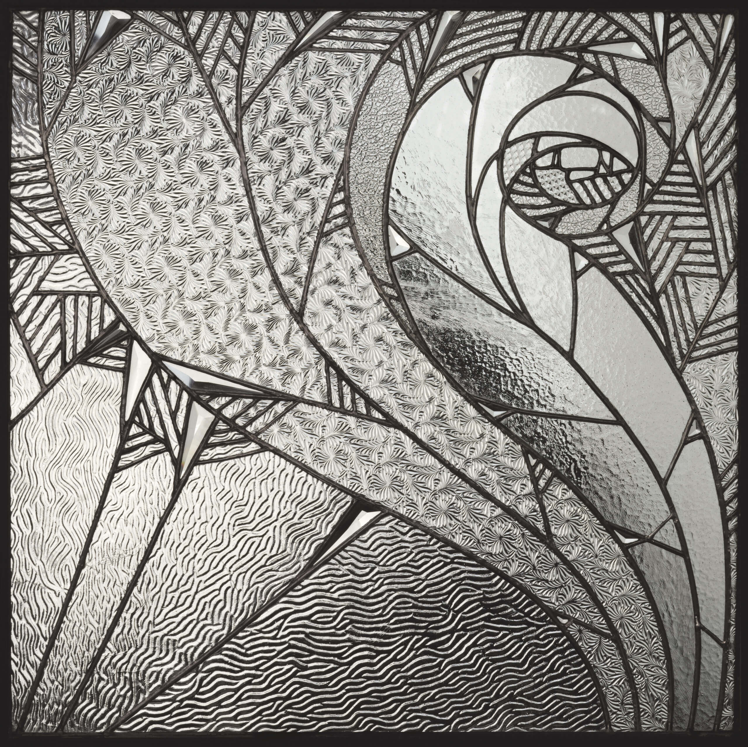
The quality of Moser’s design for the two “Fensterblätter” – “window leaves”, as the two decorative leaded-glass windows are named in the catalogue of the XIV Secession exhibition – cannot be fully appreciated without the spatial context described above. It becomes manifest in its entirety only when we comprehend the interplay of individual artistic expression and function-oriented realisation. Just as they are equally legitimate as autonomous work of art and function-oriented handicraft, they act at the same time as wall picture and privacy protection. Moser reinterprets both these positions here with a view to the unity of the arts. The theme of the artistically designed glass window is by no means new around 1900. Colourful glass windows and grisailles had been in use with figurative or ornamental motifs since the early Middle Ages. What changed, however, was the role of the pictorial window as an intermediary between inside and outside worlds. Eva Jandl-Jörg points out this essential difference in her essay on Moser’s glass windows: “However functional Moser’s windows might be, artistically they tell of intimacy and openness – and thus of one of the great paradigms of modernism.” Thus if the function of the polychrome, leaded pictorial window survived in the Revival movement until the late nineteenth century as a mode of cutting off the outside from the inside world, the dawn of modernism increasingly cast light on the necessity and desirability of an exchange between the two. During the second half of the nineteenth century, the parameters for a functioning human society in Vienna changed course dramatically towards one that was middle-class and democratically oriented. Finally, by the century’s end, it was gradually dawning on people that the form and content of their everyday lives were “out of joint”. In a rapidly changing world, the conviction thus took hold that the traditional patterns of behaviour were no longer in accord with the actual social, economic and political realities. These realities, composed of individual and subjective truths, were labelled “modern” and correspondingly applied for redefining all areas of everyday life. And in the end they served the process of adapting the outside to the inside worlds. The private sphere was exposed to the public eye and the intimate world of the individual experienced unprecedented disclosure. Modern in this context means that a person lives out his or her everyday life according to individual needs and outwardly develops forms of expression capable of communicating and sharing them.
… But it clearly demonstrates Moser’s brillant handling of the expressive potential of the flat, planar style…
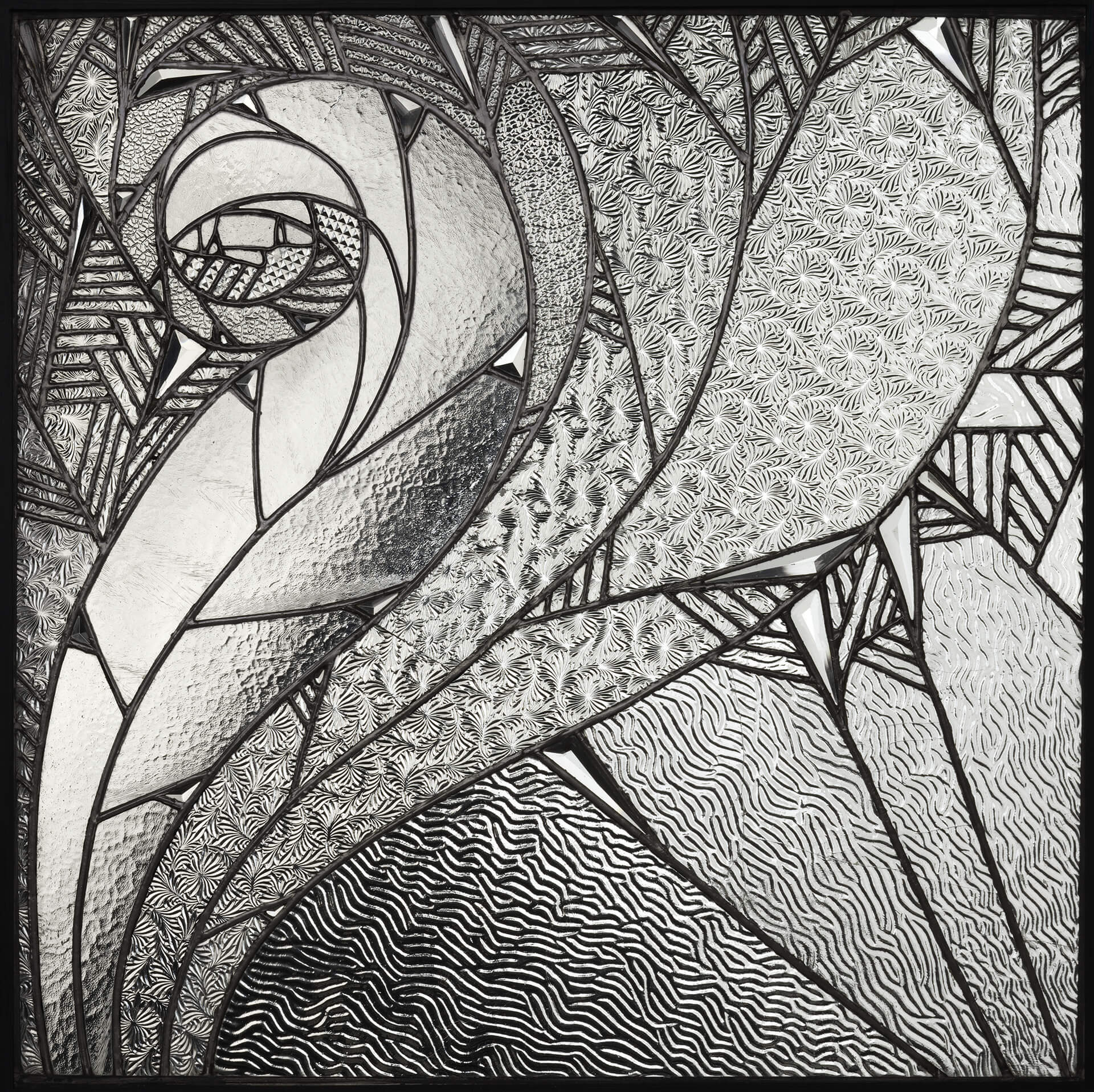
Moser’s two window leaves for the reading room in Secession Exhibition XIV are an expression of this new attitude to the outside world, which only shortly before had been screened out as a disturbance factor. Moser developed his window leaves in close collaboration with Leopold Bauer, the architect in charge of the overall concept of the reading room. Approaching the existing architectural situation as part of the total work of art entitled “reading room”, Moser worked out a supremely individual solution. In order to appreciate the full significance of his design, we have to analyse the positioning of the window leaves within the two existing windows. The integral component of Joseph Maria Olbrich’s façade design for the Vienna Secession building of 1898 consists in the striking individuality of the dimensions and the inner structure of the two windows. The oblong window frame is clearly structured into three vertical sections in the proportions 1-3-1, and two horizontal sections in the proportions 4-6, whereby the upper horizontal section stands out visually from the lower by means of a square subsection. The tripartite vertical structure thus creates a wider central zone, which is bordered by a narrow strip at left and right. All sections of the outer casements apart from the central window section of the lower horizontal zone are glazed with non-transparent relief glass. Meanwhile, the inner casements are fitted with fully transparent glass. This means that a fully visible communication with the outside world is only possible through the central lower window section, kept in the proportions 4×3. Moser now elaborates on the complex situation produced by the interplay of transparency and mere translucence. As we can see in a contemporary photo, Moser does not opt to cover the total transparent area of the lower central piece of the inner window with pictorial glass as was the convention, but adopts the theme of partial transparency – exemplified by Olbrich on the outer casement – develops it, and intensifies the dynamics even more. Following the square inner structure of the upper zone, he chooses a square and not an oblong format for his glass picture. This means that somewhat less than a third of the available space in the window frame is free and communicable with the outside world. Read this transparent slot within the larger context of the entire window and combine it with the two narrow vertical and transparent window sections adjoining and framing Moser’s glass picture at left and right and it becomes quasi a passpartout for the glass picture. The outer window frame in fact becomes the actual frame for the glass picture. The way he handles the provided window area and the placement of his pictorial motif closely approximates Moser’s job as layouter, practised as a leading member of the editorial staff at Ver Sacrum. Four white-glazed cachepots with white pansies stand in the transparent zone providing a view onto the window sill between the inner and outer casements. Like every other detail of the reading room, the choice of colour of the flowers is no coincidence either, but, similar to the white azalea in the middle of the reading table, corresponds to the overall grey-and-white colour concept of the entire room.
Moser doesn’t use traditional glass painting or staining for the technical execution of his glass image. He composes a picture by combining different, semi-transparent relief glass panes, adjoined by lead fillets, with transparent, three-dimensionally cut-glass pieces.
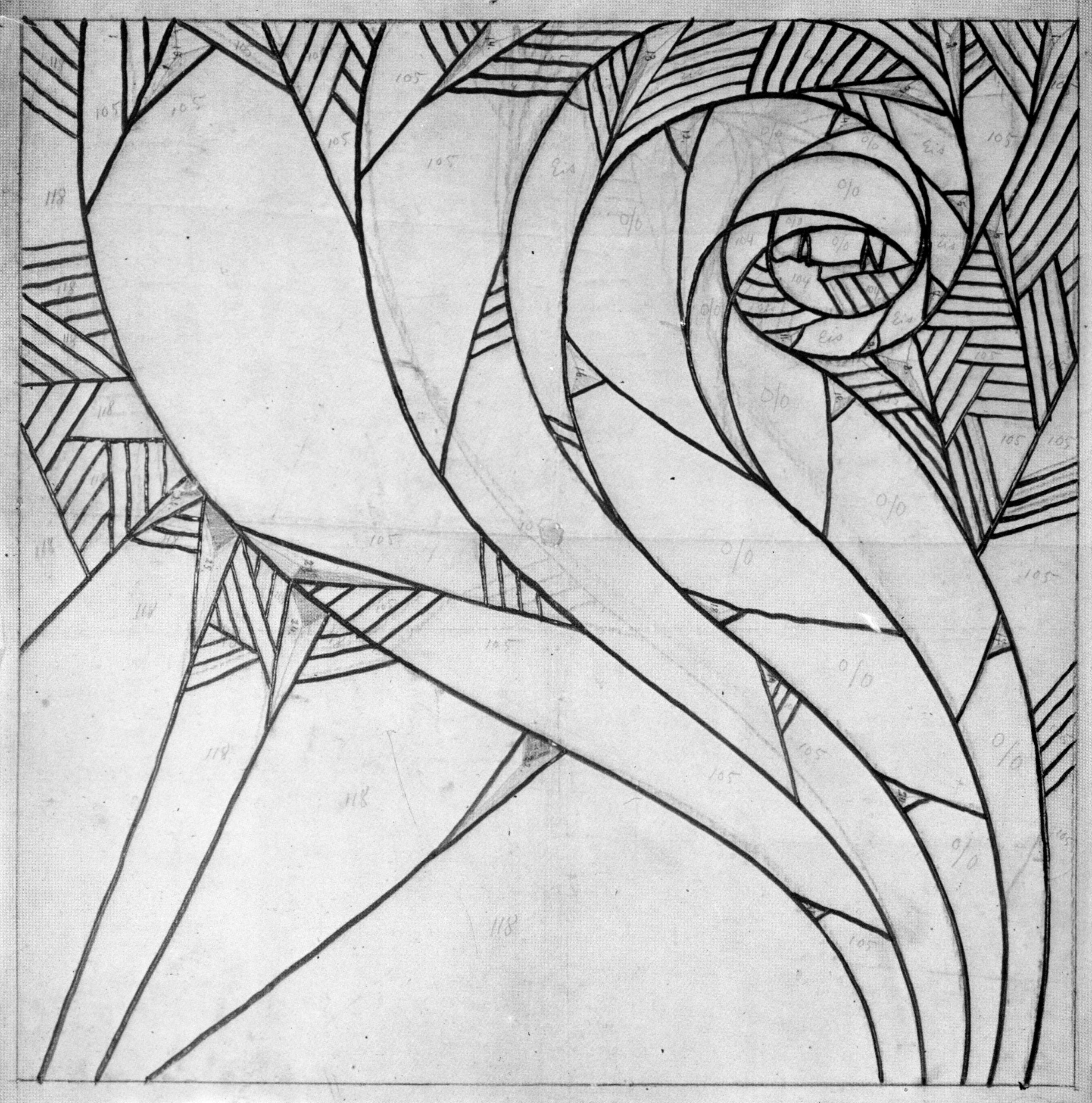
Keeping in mind the concept propagated by the Arts & Crafts Movement “Truth to Material”, one is tempted to call this technique “painting with material”. The material already possesses such potency of formal expression in itself that it has no need of extra artistic elaboration. The material per se is the aesthetic experience. Moser subjects his design to the colour scheme of the room, kept in white and grey. He needs neither primary colours nor defining interior drawing to interpret his theme. Yet the grey of the lead fillets and the subtle use of different surface structures convey the impression not of a grey-and-white drawing, but of a spatially differentiated image. Thus Moser’s surviving pencil-drawing design for the glass picture is marked not by colour specifications but solely by numbers, corresponding to the model numbers of industrially manufactured relief glass (see archive). To visualise his pictorial theme he uses four different types of glass with the specifications “Eis (ice), 0/0, 105 und 118”. 25 pyramid-cut, transparent glass types in different sizes on irregular, triangular substrate joins these. They mediate between the flat plane and three-dimensional space and generate dynamics in the materialisation of the pictorial composition. The lead fillets are not used, as they normally are to form a boundary between different glass elements, but act as the artist’s brush or pen for projecting his image onto the substrate. Their actual function is to separate pieces of glass with the same surface structure; their patterns coincide in a deliberately uneven way, yet again replacing the interior drawing.
The pictorial composition is primarily based on the planar, flat art propagated by the Secession in nearly all disciplines. This artistic connotation, strongly inspired by Japanese woodcuts, favours the graphic element over the painterly. The main artistic means of expression is the outline drawing with extremely reduced interior structure in the visual motifs. This lends an ornamental character to the visual motifs, which are composed of single, integral colour planes. Taking over the role of colour in Moser’s objective glass picture is the more or less intensive translucency attained through the different surface structure of the various types of relief glass. The technique of using an existing ornamentally structured surface as surrogate for a self-defining interior structure appears frequently in Moser’s work. His female figures composed of marbled paper are examples of this. They can be seen in 1904 incorporated into the wall panelling of the vestibule of the Flöge sisters’ fashion salon, or on the screen designed in 1906 for the Wiener Werkstätte. By configuring the forms as pure contours without any interior drawing or light-and-shade effects, he attains a degree of abstraction that demands the viewer’s autonomous involvement in order to transpose the image into three-dimensional reality. Moser replaces three-dimensionality by the material allure of the ornamented surface. He takes an important step towards abstraction within the context of the glass picture in the relief printing “Der Thaukranz im regenschweren Haar” (Wreath of dew in rain-heavy hair). A female figure standing in front of a landscape background extricates itself from its substrate material of white drafting cardboard – no longer by means of contours formed out of various materials or of drawn outlines, but solely through the image embossed into the paper. The relief contours emerging from the homogeneous substrate take shape only in sidelight. While abstraction in the relief printing arises from the chosen technique, Moser magnifies the degree of abstraction in his glass picture even more by means of the aesthetic components.
The glass picture’s motif is based on the representation so beloved internationally around 1900 of the ornamentally transmogrified female figure. Moser shifts it to the edge of the plane, twice adopts the S-shape of its back and reinforces it through straight lines running in the opposite direction. This produces a balanced composition reinstating both diagonals of the picture area. It is as rhythmically dynamic as it is statically balanced and conveys an atmosphere of tranquillity fitting for a reading room. Outside and inside are reconciled. Moser’s choice of an abstract and not of an objective rendering enhances this mood. His degree of abstraction is all the more remarkable if we compare it to a picture likewise of a mirror-inverted pair executed in leaded glass by Charles Rennie Mackintosh, which was installed in 1900 to cover a ventilation shaft in the Ingram Street Tea Room. Moser’s female figure is transfigured into contemplative movement. She loses her corporeality and becomes an abstract ornament. The only remaining objective pictorial element is her contoured face. The glass inlays are cut in pyramidal form and raised from the plane; their prismatic light refraction generates an additional shimmer of movement, but are simultaneously implemented by Moser to accentuate the change of direction of colliding lines or the final point in a direction. The lead fillets are aligned in close parallels like hatching and might be read as shading elements, thus lending the composition a certain spatial depth. Mackintosh’s influence on the artistic development of Moser and Hoffmann cannot be overestimated. The Vienna Secession was in lively contact with him already prior to 1900, both personal and in correspondence. This finally led to the presentation of the room he designed with his wife Margaret Macdonald for the Secession Exhibition VIII in 1900, an interior that steered the aesthetic sense of the Viennese into new and undreamed-of paths. Mackintosh incorporated various decorative tablets into the wall panelling of this room, among them the stylised image of a rose. The important thing here is not to point out a direct relationship between this rose motif – repeatedly occurring in Mackintosh’s oeuvre – and the head of Moser’s female figure, but to call to mind Mackintosh’s abstracting mode of representation. Although completely different in approach, it must have motivated Moser to change tack into this – for him – unexplored direction. In 1904, Moser used the motif of the ornamentally transmogrified female figure once more as a decorative wall panelling for the first international presentation of the Wiener Werkstätte in the Hohenzollern Kunstgewerbehaus in Berlin. The sole survivor of this is an old black-and-white photograph, so that neither the original colour scheme nor the material nor technique of execution can be identified. But it clearly demonstrates Moser’s brilliant handling of the expressive potential of the flat, planar style. It is one of the main themes of Viennese art around 1900. In the interplay of contrasts between three-dimensional space and flatness it attains a sensuous virtuosity that even now has lost none of its fascination.
CWD
Archive drawings / pictures